Low Vision Home Safety: Enhancing Contrast and Color
For individuals with low vision, it can be difficult to distinguish between similar colors, such as curbs and sidewalks, white or beige pills, or a white toilet on a white floor. Enhancing color and contrast in your home is one of the simplest, most cost-effective, and effective ways to improve your ability to navigate and perform daily tasks.
Understanding the Principles of Color and Contrast
Contrast sensitivity is the ability to detect differences between light and dark areas. Colors that are similar in hue, such as navy, brown, and black, are difficult to distinguish. Increasing the contrast between an object and its background generally makes the object more visible.
Keep these principles in mind when evaluating your home:
- Maximum contrast: White or bright yellow objects against a black background typically provide the most substantial color contrast.
- Reflectivity: Bright, solid colors—like red, orange, and yellow—are generally the easiest to see because they reflect the most light.
- Solid backgrounds: Use solid colors for backgrounds to make objects stand out. Avoid patterns, prints, or stripes, as they can be visually confusing.
- The lighting in a room can affect color and contrast perception. Bright light can enhance the visibility of contrast and colors. Dim or softer lighting can create more challenges.
Examples for Using Color and Contrast Around the Home
Consider the following general applications:
- Place light-colored objects against darker backgrounds or dark-colored objects against a lighter background. For example, a white sheet of paper is more visible against a dark desktop. Using a white spatula with a dark pan will improve safety and visibility.
- Household files: Use fluorescent colors for Post-it notes, stickers, or markers to color-code files, documents, and bills.
- Cabinets and doors: Mark cabinets and the edges of doors with brightly colored tape to make them easier to detect when open. Paint doors, doorknobs, and door frames in colors that contrast with the hardware, wall, or other background.
- Furniture: Mark a specific chair, desk, or workspace with contrasting colored tape, a colored cushion, or a brightly colored ribbon to help you locate a specific location or activity. Use light colored pillows or throw blankets with darker furniture.
- Baseboards and flooring: Paint baseboards in a color that contrasts with the walls and floor coverings. Choose solid, non-patterned floor coverings to emphasize the boundary between the wall and floor.
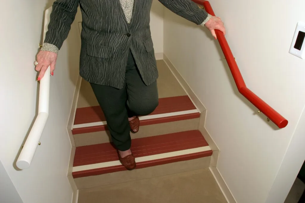
- Stairs and thresholds: Apply a contrasting non-slip rug at the bottom of a staircase to indicate the floor. Mark the edges of the stairs with contrasting or brightly colored tape or paint. Motion lighting at the side of the steps will improve safety.
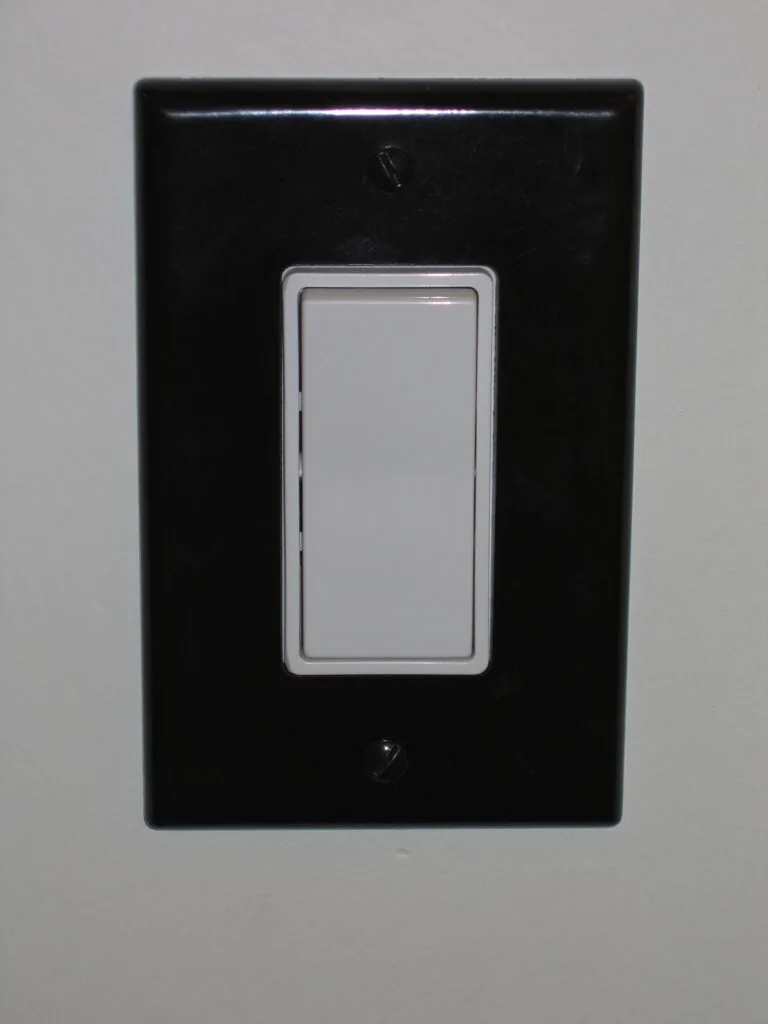
- Switches and outlets: Install switch and outlet plates that contrast with the walls. Illuminated light switches can also provide good contrast in a dark room.
- Trip hazards: Remove tripping hazards, such as rugs, cords, and clutter, from walkways. For area rugs that must be kept, secure their edges with double-sided tape.
- Bedding: Use a dark bedspread for light-colored bedroom carpets.
Room by Room Examples: Bathroom
- Towels: Drape a colored towel over the tub’s edge if your bathroom is predominantly white.
- Accessories: Use dark-colored items (such as a soap dish, toothbrush, or cup) on a light-colored counter, or white items on a dark-colored counter.
- Toilet seat: A dark toilet seat provides contrast against a lighter toilet. There are also motion lights that increase the visibility of the toilet bowl.
- Bottles: Use a light bottle for shampoo and a dark bottle for conditioner for easy differentiation.
- Washcloths: Select colored washcloths to make them more visible.
Kitchen
- Dining: Use a dark placemat or tablecloth for light-colored plates and vice versa. Avoid tablecloths or placemats with busy patterns.
- Appliances: Use contrasting dots or stickers to mark dials on ovens or microwaves.
- Measuring tools: Use dark-colored measuring cups for light ingredients (such as sugar) and light-colored cups for dark ingredients (like coffee).
- Drinkware: Use dark glasses for light-colored liquids (such as milk) and light or clear glasses for dark-colored liquids (like coffee). Avoid clear glasses.
- Cutting boards: Use a dark cutting board for light-colored foods and a light-colored cutting board for dark-colored foods.
Around the House:
- Medication Management: Use a lipped tray lined with dark tape or dark cloth to sort medications. Task lighting can help to distinguish similar colors of tablets.
- Landscape: Use light-colored landscape stones or fencing to differentiate between the lawn and landscape beds.
- Garage: Use lighted garage door controls. Consider using assistive technology for voice control of garage remotes.
- Habits: Encourage everyone in the household to push in chairs and put away items that could cause a fall.
Harnessing the power of color and contrast is an immediate and effective strategy for creating a safer, more accessible environment for individuals with low vision. By mindfully implementing these simple, low-cost modifications—from marking the edges of stairs to using contrasting dishes—you can significantly enhance your ability to navigate your home, perform daily tasks, and prevent falls.
Taking a systematic, room-by-room approach to applying these principles can help transform a visually confusing space into one that promotes independence, confidence, and overall safety for individuals with low vision in the home.
Updated 2025 by Cheri Harbour [email protected]