Bathroom Accessibility
Tile, water, slippery surfaces—the bathroom can present many hazards for someone with even a slight degree of low vision or loss of mobility. Minimize your risk of accidents with these easy-to-manage adaptations.
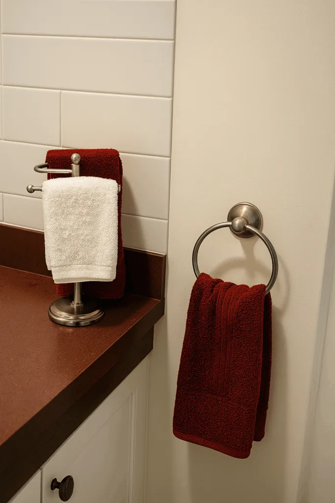 In your bathroom, hang towels that contrast with the wall color.
- Use soaps and shampoos in pump dispensers to prevent spillage, or hang a shower caddy in the shower to hold your soap and shampoo.
- Put a nonskid mat, friction tape, or patterned appliqués on the bottom of the tub or the shower floor. Choose colors that contrast with the surface.
- Have a grab bar installed on the tub’s edge or a railing on the shower wall to prevent slipping when getting in and out.
- Have additional lighting installed over the tub and shower.
- Replace a white toilet seat with a darker, contrasting seat. If necessary, put a frame with arms over the seat to make sitting down and getting up easier.
- Learn how far you must rotate faucets to get the desired temperature. Turn on the cold water first … then add hot water. Turn off the hot water first.
- Use a hand-held showerhead to test the water temperature on your hand in the shower.
- To get the right amount of toothpaste on your brush, use a dark-colored or striped toothpaste. Hold the bristles of the brush between your thumb and forefinger. That way, you can judge the amount as you squeeze it from the tube. Another way is to put the toothpaste on your finger and then on the brush.
- File your nails rather than using scissors or a clipper. If you have diabetes, be sure that only a medical professional cuts your toenails.
- Shave with an electric razor rather than a manual blade to avoid nicks and cuts.
By making your bathroom safer and more conveniently organized, you can minimize the possibility of falling and take care of personal hygiene more efficiently.
Contrast
Using visual contrast as well as using contrast in surface—a change in flooring from one area to another, and touch—such as using rubber bands to distinguish bottles of shampoo can help people who are blind or low vision navigate home environments safely and effectively. Using a good contrast/bad contrast approach, you can check out how different options for contrast can help a person with low vision function more safely in the bathroom. As you will see, these changes do not need to be expensive. All can be done by using visual contrast and texture changes.
Note: Many people with low vision cannot distinguish colors per se but can often detect visual contrast. Also, when choosing a color scheme, use solid colors rather than patterns and make sure that the colors you use provide adequate contrast for the person who will be living in the environment.
Below you will find examples of good contrast versus bad contrast in the bathroom, with images showing both scenarios in the sink and bathtub areas of the bathroom.
Sink Area Without Contrast
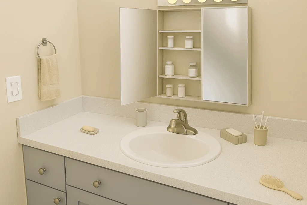
The low contrast bathroom sink graphic shows a sink with a soap dish and soap holder, cup, toothbrush holder with toothbrushes, medicine cabinet with medicine bottles, light switch, hand towel, and hairbrush. All the items are a light color against light-colored walls and a light-colored countertop. The labels on the medicine bottles are printed in light text against a light background, all providing examples of insufficient visual contrast.
Sink Area With Contrast
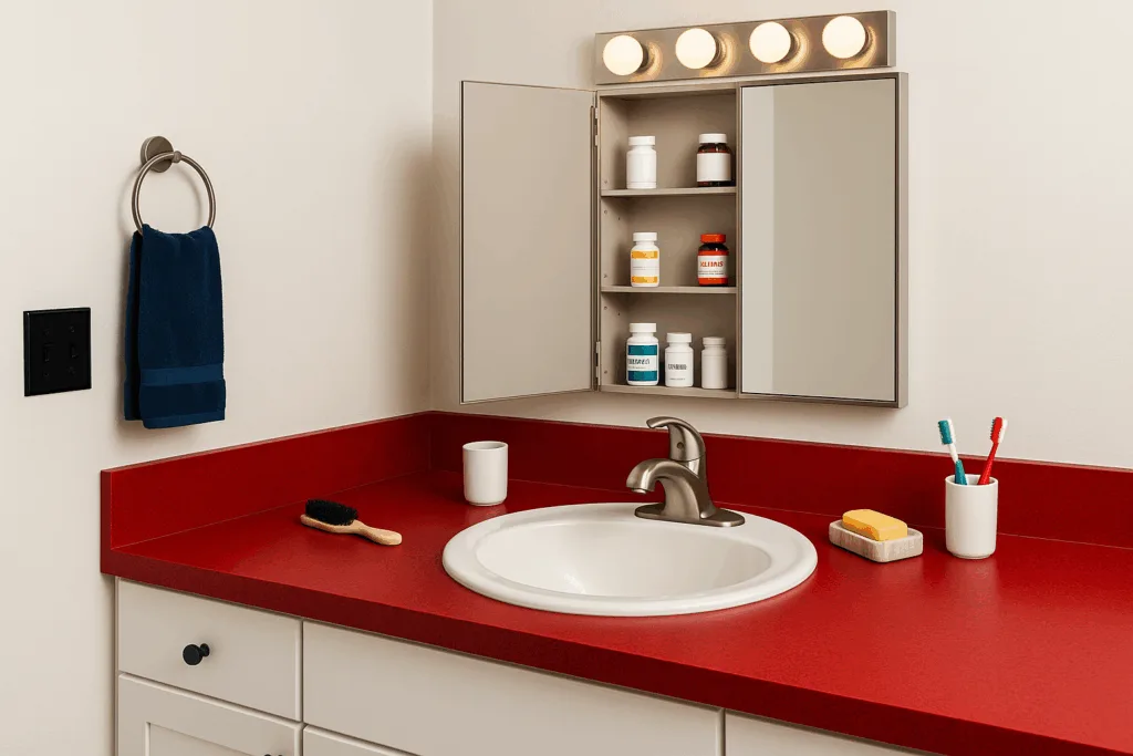
- The countertop is a dark color, and the walls are a light color.
- All of the accessories were selected to provide maximum visual contrast and in some cases, texture.
- The soap dish is light with dark-colored soap.
- The cup is white against the dark background of the countertop.
- The toothbrush holder is light with dark-colored toothbrushes.
- The medicine bottles have large print lettering in dark ink on a light background; one medicine bottle has a rubber band, and another has two rubber bands to distinguish them texturally from the other bottles.
- The light switch plate has a dark background and white switches.
- The hand towel is dark against a light wall.
- The hairbrush has a light handle against a dark background.
Bathtub Area Without Contrast
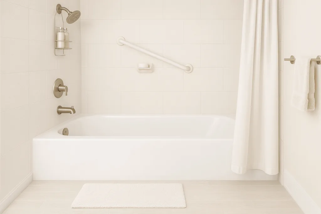
The low-contrast bathtub area features light flooring, light walls, and a white tub and tub surround. The tub mat and grab bar are light colored; the soap is white; the shampoo and conditioner bottles are light-colored, the same size, and are indistinguishable; the towels are light colored; the shower curtain is a light color; and the bathmat is white.
(Note: all bathmats and tub mats should have a non-skid backing.)
Bathtub Area With Contrast
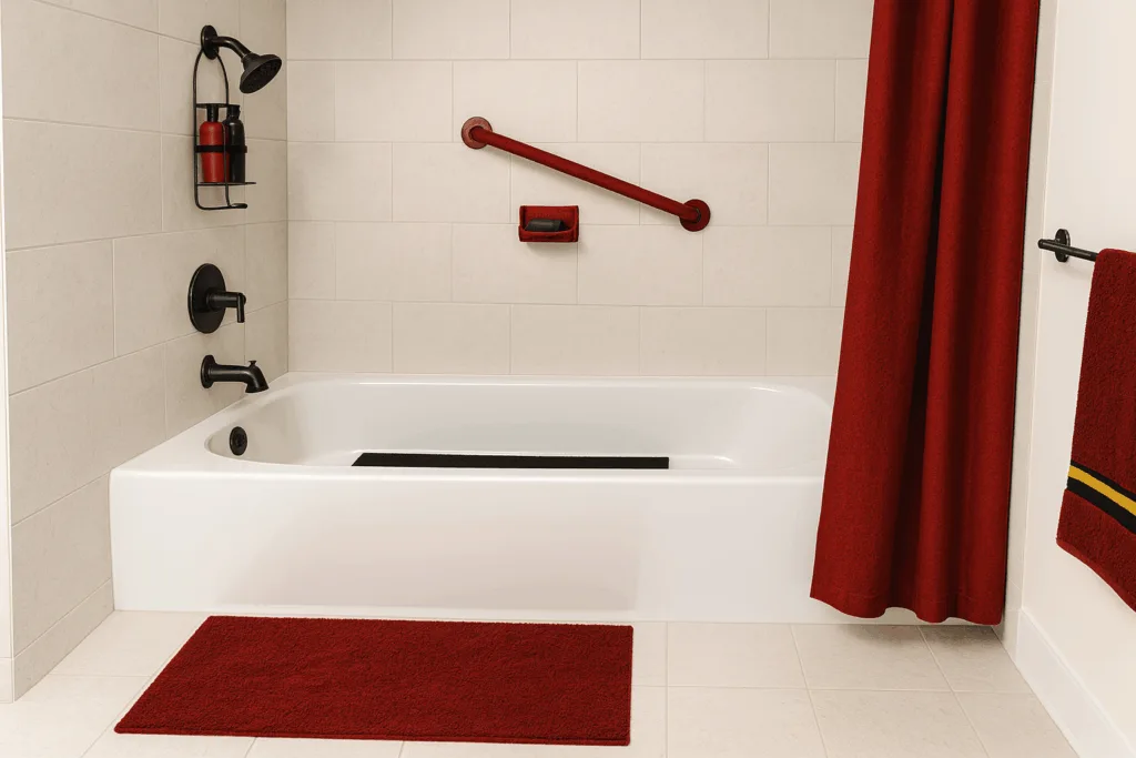
The high-contrast bathtub features light flooring, a white tub, and white walls, with changes only in the accessories. All were selected to provide high visual contrast and differences in texture.
- The tub mat is dark;
- The grab bar is a dark color
(Note: these can be purchased locally in different colors, or you can use contrasting tape to achieve the same effect);
- The soap is a dark color;
- The shampoo and conditioner bottles are a dark color, and the conditioner bottle has a rubber band to distinguish it;
- The towels are dark;
- The shower curtain is dark;
- The bath mat is dark
(Note: all bathmats and tub mats should have a non-skid backing.)